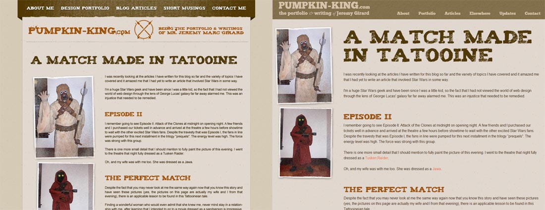
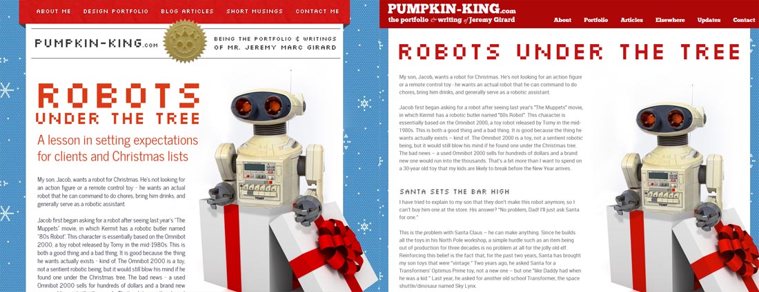
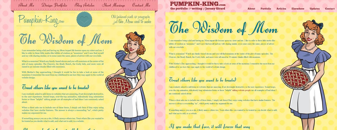
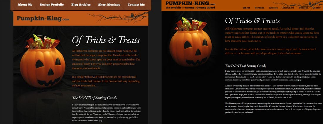
Art Directed Articles: Then and Now
Chris Coyer of CSS-Tricks.com recently published an article about art directed blog articles, a practice that gained popularity back in 2009-2010, but which has fallen out of favor in the years since. This decline in popularity could be attributed to the extra time it takes to design and publish articles with this approach or because of the rise of responsive design and the challenges that multi-device support adds to heavily designed, art directed articles. Regardless of the reasons for this drop, I have personally chosen to continue using this approach on Pumpkin-King.com, even after redesigning the site earlier this year.
Making Pumpkin-King.com responsive was a project I put off for quite some time – mainly because of my library of art directed articles. All of those articles had been designed for a very specific, fixed width display, so the prospect of making them all responsive was a daunting task. I considering leaving those older articles untouched and in a previous version of the site, similar to what Jason Santa Maria has done, but in the end, I decided that I wanted to carry them over into the new site. This meant manually rebuilding those articles and designs and redeploying them in my CMS (ExpressionEngine).
Making Compromises and Learning
As I am sure you have guessed, this was a substantial undertaking and, in the end, I decided to carry over only the most recent articles or any that analytics showed were still generating some traffic. I would’ve loved to have every article made responsive and added to the new site for launch, but I knew that if I wanted get the site done in a timely fashion, I had to make a compromise. By only adding a subset of the articles to begin with, I was able to get the new site launched without being held back by the need to add every single older piece. Eventually, however, I do intend to add those older articles. Not a perfect solution, but the one that I felt was right for my site and this project.
The process of moving older articles onto my new, responsive website was a learning experience for me. Having published art directed pieces for years, but never in a responsive way, this migration gave me some valuable insight into how I needed to update my workflow and what changes I needed to make to continue using this approach on my site.
What Has and Has Not Changed
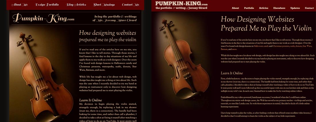
The workflow itself remains largely unchanged. I still start with the article itself and create a first draft of the content. With that draft in place, I begin working on visuals in Photoshop to get a rough idea of how I want the design to look before moving into the CMS and creating a small, article-specific style sheet to power that article.
The workflow is the same one that I’ve used for years, but what about what has changed?
I Write Less Often
When I first began using this art directed approach, I kept to strict schedule of publishing at least 1 new article each month. That has definitely changed. Outside of my Halloween and Christmas themed articles, which I continue to publish regularly in October and December each year, my publishing schedule has become much more relaxed. Today, I add articles when I have something to say – like I am doing with this one, and not when the calendar tells me it is time to add something new. By relaxing the publishing schedule, I find that the prospect of designing new articles, and building them to be responsive, is far less of a daunting endeavor.
Designs Are Less Involved
Previously, article designs were much more involved than the ones I am doing today. In fact, when I carried over my old designs, I had to make a number of changes to those designs so that they would work in my new responsive templates.
For each one of my articles, I break the design down into specific areas that allow for customization. On older articles, I had adjusted not only the colors, type, and imagery used in the body of the article, but also the background images for the header and footer areas, the navigation links, and even the logo at times. This meant that each design required a lot more CSS styles, and often quite a few more images, to accomplish.
On the current version of my site, I have scaled back the areas I customize for each article or, at the very least, the way that I customize them to make each of those articles easier to execute and make responsive.
I Am More Mindful of Performance
By scaling back the article designs, I am able to use far fewer images than in previous versions. Those older designs, many of which were built prior to the rise of web fonts, required a number of images to create. Oftentimes, each header in the article used image replacement to get the desired font in place instead of the font-face fonts that the current site uses.
Now that the site is responsive and I am considering an audience that uses mobile devices as well as desktop screens, the need to deliver fewer images and use CSS for visual effects whenever possible helps articles load faster than previous versions.
I Larger Ignore Old Browsers
Looking at my analytics, I get little to no traffic from older browsers because the audience my site appeals to do not use those browsers. This means that I can build my articles’ designs without worrying whether or not the CSS I am writing will translate effectively to outdated versions of IE. CSS properties, like background scale, that do not work in older browsers can still be used on my new site. In fact, that background scale property has been particularly helpful in translating fixed width designs over to responsive layouts!
Why Do You Still Use it?
Regardless of any changes I have made in my process, art directed articles still take a fair amount of work to publish. So why do I continue to use this approach when many others have moved away from the practice? It fits my style.
A quick read of my articles should give you an idea of my writing style here on Pumpkin-King. I tell stories about my life – about the places I go, the things that I do, or other topics of interest to me. I then relate those stories to some lesson in web design. This art directed format works well for me and my storytelling approach.
Back in 2009, when I first began publishing art directed blog articles, I used this approach because it was trending and I wanted to challenge myself. Today, in 2013, I continue using this approach because it is right for me and for my site’s content and because I have been able to adapt my publishing workflow to fit the responsive needs of my current site.