Adding Action Features
I love toys. I’ve been collecting action figures for many years now and my current collection is a room-filling display of transforming robots, Jedi knights, superheroes and villians, monsters and more.
My 6-year old son loves toys too. Not surprisingly, we share pretty similar tastes when it comes to the toys that we like. My son likes Transformers, I like Transformers. My son likes Star Wars, I like Star Wars. My son likes Batman…well, I’m sure you get the point.
While my son and I may agree on the brands of toys we like, we tend to have very different opinions on the specifics of what exactly makes a toy ‘cool.’

Accuracy vs. Action Features
Like many adult toy collectors, I prefer toys that are as accurate to the source material as possible. Whether the property in question is from a movie, comic book, cartoon or video game, a toy that is well sculpted and true to its source material is what I look for when I add a piece to my collection.
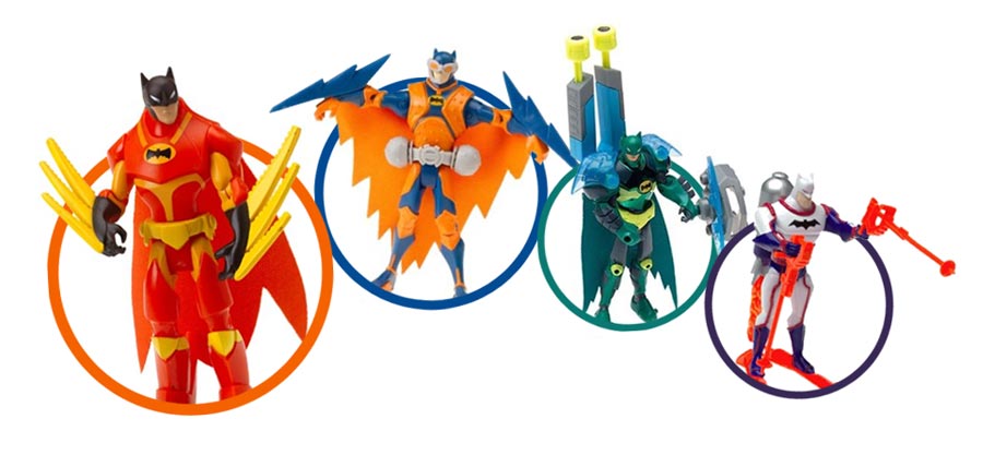
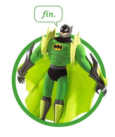
My son, on the other hand, cares very little about the visual accuracy of the figure. Kids his age want the toy to “do something.” It doesn’t matter that Batman is dressed in a day-glo, bright orange outfit (something I am pretty sure the Dark Knight of Gotham City would never wear). As long the toy has some oversized, missile launching accessory, or something that moves, lights up or makes noise, then my son loves it.
I like my toys to look cool, my son likes his to do cool things - to have some ‘wow’ to them. Come to think about it, his opinion of what makes for a cool toy isn’t all that different than some clients' opinion of what makes for a cool website.
Designing for Your Clients' Clients
One truth in web design that is often overlooked is that, with the possible exception of a web application meant to be used as part of internal workflow, we are really not designing for our clients - we are designing for their clients. When we create a public facing website, we need to keep in mind who our primary audience is and we sometimes need to remind our clients that they are not that primary audience.
This isn't to say that a client shouldn’t love their website, they absolutely should, but part of our job as designers is to find ways to make our clients say, “Hey, that’s pretty cool!” about their site, while bolstering the user experience and forwarding the business goals of the site itself. Yeah, no small task.
Handling Requests for More “Cool”
The first thing I do when a client comes to me and says, “I saw this cool thing on another website,” is to hear them out to see if their idea has merit. That may seem obvious, but we are often quick to negatively judge client suggestions, likely because so many ideas that start with the lead-in of “Wouldn't it be cool if…” are just horribly inappropriate. Still, I can personally point to a number of ‘cool’ ideas that clients brought to a project that helped improve it, so for as many bad ideas as you may have to consider, the first step in handling client requests is to really listen to them.
If the idea presented is, indeed, inappropriate or contrary to the overall goals of the site, I simply respond to the suggestion with a question:
“Let me ask you this - how does that addition help your site visitors do X?” - with ‘X’ being whatever user goals or conversion metric has been identified for the site. In the end, this is really all that matters. If an addition will help further the goals of a site in some way, then it is something that should certainly be considered.
Look! My Web Site Talks!
One suggestion I seem to get quite often is to add those little talking people to a site. You know the ones I mean – they casually walk onto a page and start talking to you about the site and the company. They also seem to feature people who really like to use their hands when they talk.
Over the years, I have had a dozen or so clients either suggest we add this to their site or at least ask my opinion about it, yet I have never once found a user who found this feature useful. In fact, most people that I ask about this, including some of the clients who have brought it up in the first place, find those video people annoying at best. So why do clients suggest adding these little talking heads to a site if no one seems to like them? I’ve asked clients this question and the general answer has been that they saw it on a site, said “Hey look, this site does something!” and figured they should do it on their site too. I then ask if, in addition to “doing something”, they found the video person helpful or if it more easily allowed them to complete the task they had gone to the site for in the first place. Without fail, the answer has always been a resounding “no.” In fact, I’ve had people admit that the little talking person distracted them from their real purpose on the site and they ended up just leaving after listening to a small part of the video presentation. That’s not very ‘cool’, is it?
What Clients Really Want
When a client asks for a little talking video person on their site, or some other ‘cool’ feature, what are they really asking for? In most cases, they simply want their site to “do something.” Granted, a site that looks great, effectively communicates a company’s message and drives visitors towards a goal destination and desired conversion is definitely doing something pretty spectacular, but the sad truth is that there is more ‘wow’ factor to a talking head than there is to an effective design and communication strategy.
Clients want to be able to proudly show off their site and a flashy feature makes it easy to do so. Unfortunately, while an over-the-top site addition may serve a client well as they are trying to show off some website bling-bling, it often gets in the way of site users who are trying to accomplish some task on the site.
Remember those animated site intros that, thankfully, have gone out of vogue? They offered clients something exciting and flashy to show off, but they got in the way of users who didn’t need an awesomely animated presentation every single time they visited the site.
Clients want their site to “do something”, but we have to guard against adding extraneous features to the site that will prevent your client’s clients from ‘doing something’ – like actually using the site!
Making a Cool Action Figure
So what makes for a cool action figure? It depends on who it is intended for. I have some pieces in my collection that are incredibly source accurate with a fine-art level of sculpting and paint applications, but they are statue-like in their playability and, in some cases, fairly expensive collector items. As much as I like these pieces, they aren’t very cool to my son because they aren’t meant for him.
On the flip side, my son has a number of garishly costumed superheroes who I would never display in my collection, but they are perfect for him. They have giant, spring-loaded accessories, ridiculous clip-on costumes and other over-the-top action features and they offer my son hours of imagination-fueled playtime.
So which of these is a cool action figure? They both are, because each of them are appropriate for their intended audience.
Universally Cool = Transforming Robots
While ‘cool’ is relative to the audience meant to enjoy an item, be it an action figure or a website, there are those rare instances where something is universally cool – able to be enjoyed by multiple audiences equally. Like Transformers.
While my son and I may have different aspects of the “robots in disguise” which we appreciate, the end result is that both of us love them. I appreciate the engineering and design that goes into making a toy that looks equally cool as a robot as it does a Mack truck, while my son just loves the fact that he can have a robot-battle-royal that transforms into a high-speed car chase while playing with the same toys.
1 design – 2 audiences enjoying it differently and yet equally. Now that’s cool.
Universally Cool Websites
So what makes for a cool website? One that can be used, and enjoyed, by multiple audiences, each with different agendas and goals. A site that has ‘wow’ factor, but finds a way to utilize that wow factor as a way to further the business goals of the site and the needs of users visiting that site.
This is one of my main design and development goals right now. To find ways to add features to sites that do more than just wow a client or even effectively communicate a message. I want to take it to the next level and use that wow factor to actually help users complete the primary purpose that the site was built for – be it to make a purchase, become a member, or some other conversion factor. I want to use ‘cool’ to help users use a site and drive business for my clients, because when it comes right down to it, I can’t think of anything cooler than that.
