Welcome to Version 10
Today I launch the latest edition of my website and I'm pretty excited about that. My site is now officially in the double digits with the launch of this redesign. Welcome to Version 10 of Pumpkin-King.com.
A Look at the Past
Before I jump into the new site design and features, let's take a look at what has come before this point - the 9 previous versions of Pumpkin-King.com.
Over the years, I’ve redesigned this site for a variety of reasons. Early on, I did so because I was learning and I used Pumpkin-King.com as a platform to try new things. Later on, I redid my site because I grew bored with the site and just wanted a change.
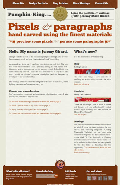
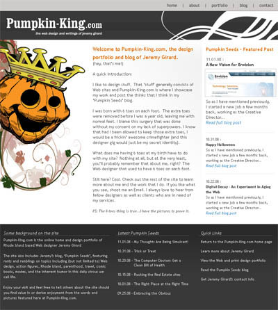
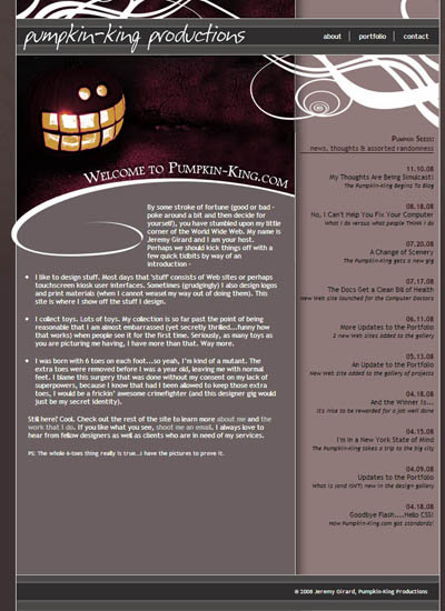
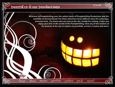
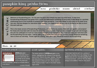
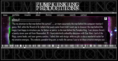
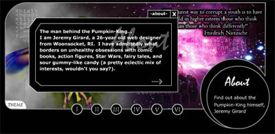
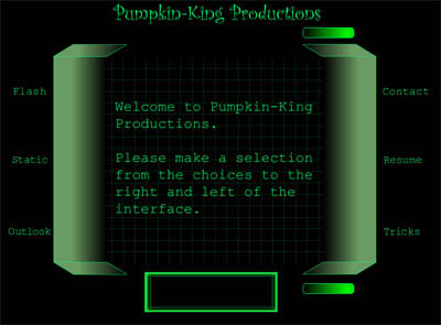
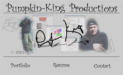
Starting with version 7, which was launched in 2007, I began to retool the site for more practical reasons. Version 7 was as a move away from the animated Flash interfaces that had dominated every previous version of the site to standards-based HTML/CSS. That edition of site was also the first one to feature a blog – a section which eventually grew and necessitated yet another redesign in 2009 when I moved Pumpkin-King.com into a CMS (ExpressionEngine) for version 8. I also began my “art directed blog articles” for this version – a blogging style which was trending around this time and which, despite the current drop in this approach’s popularity, I still enjoy using and have maintained even in this latest version.
In 2011, the website and my art-directed articles were redesigned once again for Version 9 - this time to use HTML5 and CSS3 throughout the site. I also used this redesign project to upgrade the CMS from ExpressionEngine 1.6 to the much improved ExpressionEngine 2. This version of the site had served me well for the past few years and it brings us up to the present and the need for another redesign and another version. It’s time for Pumpkin-King.com to become responsive.
Embracing Responsive Web Design
Responsive web design is something I speak about quite often and the bulk of my work for the past 2-plus years has focused on responsive design and multi-device support. I’d be lying if I didn’t admit that my own site being non-responsive has made me feel like somewhat of a hypocrite. The reason it has taken me this long to remedy the situation is because of those aforementioned blog articles. Since each article was designed uniquely and to a specific design width, making all those articles responsive was a daunting task and it fueled my continued excuses for not making a much needed change – until now.
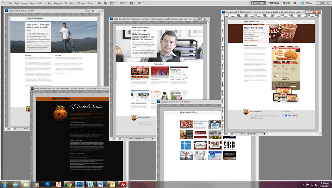
Energized and rearing to go after attending a recent conference (An Event Apart in Boston), I decided to bury the excuses and make this responsive redesign happen. You are viewing the results of that enthusiasm here now.
So, besides a fully responsive layout for the new site, what else is different in Version 10? Here's a quick overview...
What's New?
First off, I decided to make myself the visual focus of the new design - something I had not done since Version 1 (back in 1999). While previous designs often used images and illustrations of pumpkins as core elements of the site’s visual design, my move into teaching, speaking, and writing, in addition to my continued design and development work, has really forced me to put myself out there in a pretty public way. Bringing that approach into the new site design and focusing on “the brand of me” was a logical progression for this latest redesign. Thanks to Jeff from Envision for the main photo I used on the site’s homepage.
It’s not all about me, however. For this new site version, I also wanted to better showcase my work. To that end, the individual portfolio pages of the site were also due for overhaul with each one being given the hero treatment with large, visually rich header images (for the larger-screen versions of the design) and larger screen shots of the work, including a look at the multi-device, responsive layouts for appropriate projects.
My art-directed articles are indeed still here in the blog, although I did leave a handful of those articles out of this version of the site. Some of those articles will be added at a later date, while others whose content is less relevant today than when they were authored (in some cases years ago) will be put to rest for good.
Finally, of note is a new addition to the site - the elsewhere section, featuring links to the articles I have authored that have been published on other sites and in other publications. On my last site, links to these articles were added after that fact, since the bulk of my work as a guest author came after that site’s initial design. With my writing being such a big part of what I am doing these days, I wanted my newest site to treat that content accordingly and this section is my answer to that need.
So there it is – the reasons for, and changes on, this latest version of Pumpkin-King.com. If you dig what I have to say here on the site, be sure to follow me on Twitter or connect with me on Linkedin.